Design-system study · 2024
Telegram study
Telegram for iOS, rebuilt from the pixels up.
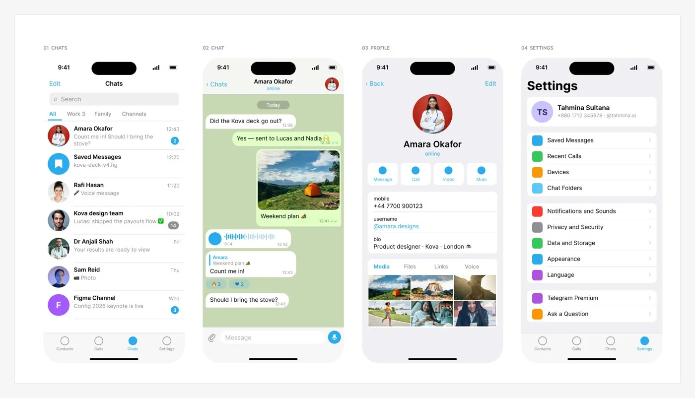
A self-initiated, unofficial study: I rebuilt Telegram for iOS as a Figma design system (tokens, type, bubbles, cells and full screens) to learn how it stays fast and calm.
- UI/UX
- Frontend
- QA

- Role
- Self-initiated · not affiliated with Telegram
- Year
- 2024
- Disciplines
- UI/UX · Frontend · QA
01 The problem
Why does Telegram feel faster and calmer than apps that do much less? I measured the shipping app to find the system behind it.
02 Key decisions
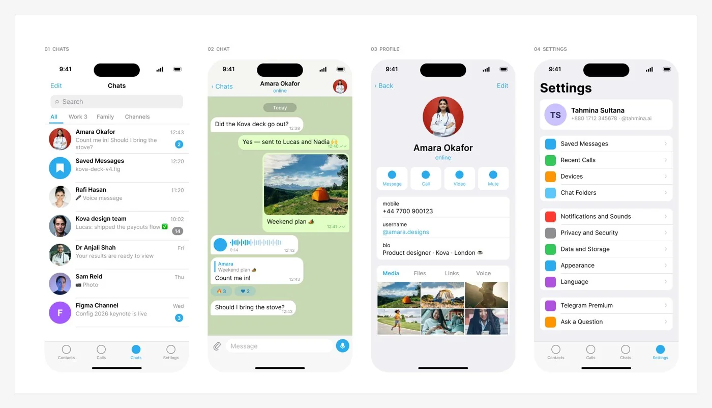
Foundations as tokens
Colour, type and an 8-pt grid, published as Figma variables with light and dark modes.
Components with real states
Bubbles (in, out, reply, voice, photo, reactions), cells, input bar and switches, each with pressed, disabled and RTL.
Full screens from parts only
Chats, chat, profile, settings, call, channel and attach sheet, assembled only from the components.
03 Built in code
1struct Bubble: View {2 let message: Message3 var body: some View {4 Text(message.text).font(.body)5 .padding(.init(top: 7, leading: 12, bottom: 7, trailing: 12))6 .background(message.isOutgoing ? .outgoing : .incoming)7 .clipShape(BubbleShape(tail: message.isLastInGroup))8 }9}
04 Then I tried to break it
- Bubble tail flips in RTL
- Badge above 99
- Waveform at XXL text
- Dark-mode separators
✦ What I’d measure
Concept project. These are the success measures I designed for, not reported results.
 →